Building a Motion Framework for Starling
Client | Starling
Production | Buff
Design & Animation | Buff
Scripting | Starling + Maddi Jackson
Sound Design | James Locke-Hart

Following their 2025 rebrand, Starling approached Buff to create a series of short animations promoting features across their app and website.
Although Starling has an established in-house motion team, the scale and strategic importance of this project made it the ideal opportunity to define how the newly refreshed brand should behave in motion.
Rather than simply producing sixteen social films, we used the brief to establish a strategic motion framework: developing principles, behaviours and an animation language that could extend well beyond the campaign itself. The resulting system gave Starling a clear foundation for future motion work, while ensuring every film felt unmistakably part of the same brand.
Starling had paused much of its marketing while focusing on building its product. By the time the rebrand launched, the bank had a mature feature set ready to promote. The challenge wasn't introducing new functionality, but helping customers discover and understand features that had often gone unnoticed.
Sixteen featurettes, each around 20–25 seconds, were produced in vertical format. Their purpose was to make everyday banking tools including budgeting, payments, saving and managing debt feel clear, engaging and genuinely useful, without slipping into tutorial or product demo territory.
The Challenge
Starling wanted the films to feel vibrant and scroll-stopping while still feeling appropriate for a bank. Too functional, and they risked becoming product walkthroughs. Too playful, and they could erode the confidence and trust expected from a financial brand.
While the refreshed visual identity was well defined, there wasn't yet an established motion system to support it. The opportunity wasn't simply to animate within the new brand, but to help define how it should move: what motion should communicate, how it should feel, and which behaviours would make Starling instantly recognisable across future content.
Alongside this strategic challenge came the practical one. Sixteen films, multiple stakeholders, and legal and marketing sign-off meant the production process needed to be robust from day one. Every film needed its own compelling hook while still feeling part of one coherent campaign. Working primarily in 9:16, with additional 4:5 versions, also meant every frame had to communicate quickly without becoming overloaded.
"Starling's brand isn't built around wealth. It's built around confidence. What I particularly loved about this project was being trusted to define how that confidence should translate into motion. We pulled out the brand's core tonal attributes and developed a motion language built around direct, purposeful movement with a playful human confidence. That shaped these films while giving Starling a framework for future work."
Tom Allen, Creative Director at Buff


The Solution
Working closely with the Starling team, we translated the brand's core attributes into a set of motion principles and behaviours. Every creative decision that followed, from pacing and transitions to composition and interaction, followed those principles, ensuring consistency across the campaign while creating a framework that Starling's in-house team could continue building on.
With the motion framework established, we developed a simple four-part storytelling structure that every film could follow: open with a relatable problem, introduce the relevant feature, connect it to a meaningful customer benefit, then hand over to the brand. The framework gave each film a clear purpose, transforming familiar product functionality into concise, customer-focused stories.
The motion language itself required restraint. Rather than relying on exaggerated animation, the majority of movement was direct, purposeful and efficient, using timing, easing and composition to communicate confidence while leaving room for moments of warmth and personality. The result felt unmistakably Starling: clear, modern and human.
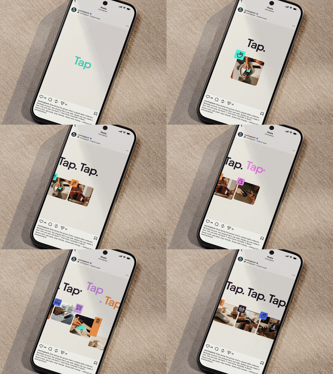
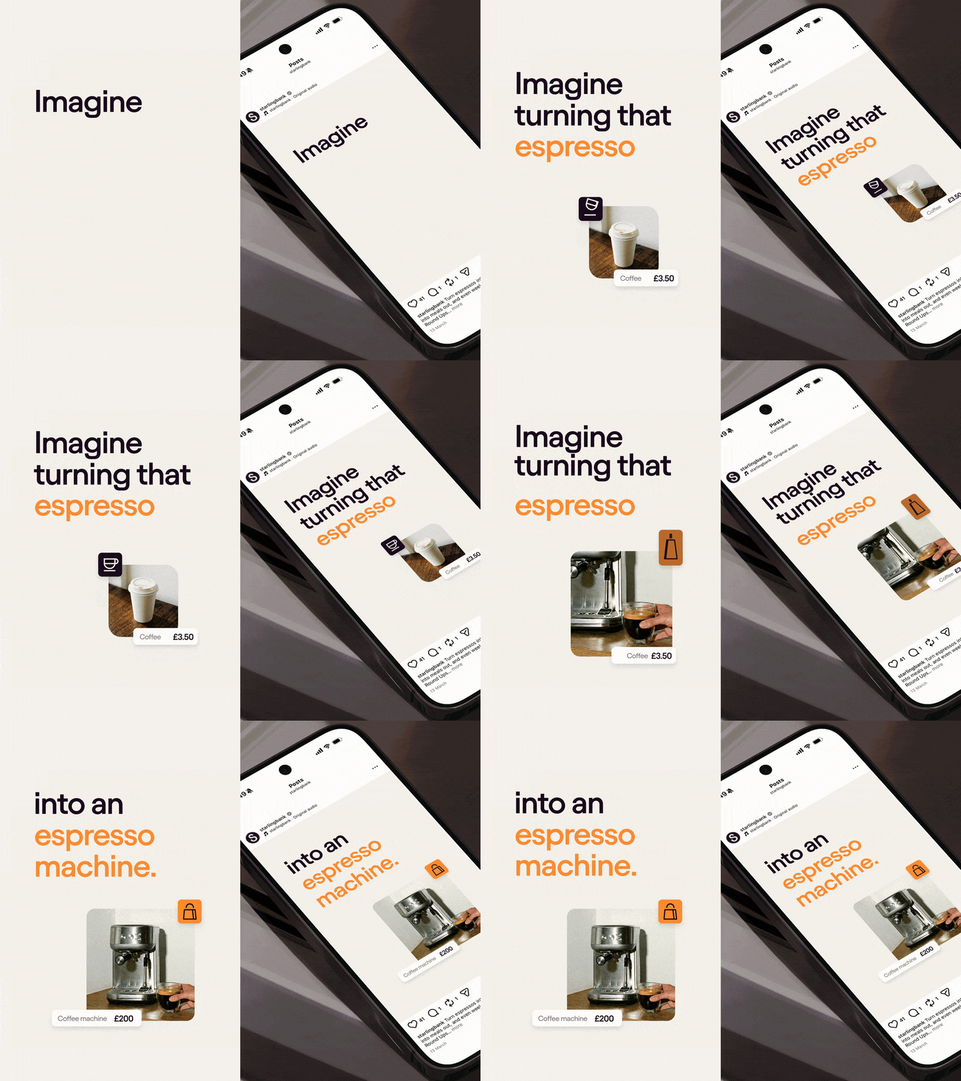
Small decisions reinforced that philosophy throughout. We carefully considered how quickly information appeared, where attention should be guided next, and how much of the product interface needed to be shown. To support the concise on-screen messaging, we leaned into emojis as an instantly recognisable visual language. Given the social-first context and Starling's approachable tone of voice, they became an efficient way of communicating ideas quickly without increasing cognitive load.
Layouts were designed to keep information visually engaging while remaining easy to understand. Transaction lists, for example, were arranged in diagonal compositions to create rhythm and movement, while the underlying UI was simplified to prioritise readability. Colour pairings were agreed early for each film, and premium stock imagery helped maintain a consistent visual quality across the entire suite.
To ensure consistency across all sixteen films, we created a comprehensive internal guide covering the creative treatment, technical approach and motion principles behind each animation. Originally developed as a production tool to onboard new motion artists and maintain consistency throughout the project, it proved so valuable that it was delivered alongside the final assets, giving Starling's in-house team a practical reference for creating future work that remained true to the motion language we had established.
The Impact
While the immediate output was sixteen feature films, the longer-term outcome was a motion framework that reshaped how Starling approached product storytelling. The work established a consistent animation language for the refreshed brand and became an internal benchmark for quality, influencing how motion continues to be used across the business.
The relationship grew beyond the original brief. After the first collection of films launched for retail customers, Starling extended the project to cover its business banking products, commissioning a further suite of 12 feature films for a different audience. That progression, from a tightly defined production brief to a broader strategic partnership, reflected the trust built throughout the project.
“Working with Buff has felt truly collaborative. The team are always open and receptive to feedback, and having our two teams work so well together made it a really great process.”
Emily Chamberlain, Brand Marketing Manager at Starling
For Starling, the work made everyday product features easier to discover, easier to understand and easier to care about, while establishing a motion language that could continue evolving beyond the original campaign. For Buff, it demonstrated the value of treating motion not simply as execution, but as a strategic design discipline capable of shaping how a brand communicates long after the final film has been delivered.


"The overall success and design language of this project has moved the Starling brand on in a really positive way. It is held up as the benchmark across the business and has been some of our best-performing content."

Neil Cooper
Next Project

Turn your brand into a motion system.
Join our newsletter
get updates from the studio